Visual perception
4 March, 2026
Why Perfect Circles Look Wrong
Why Perfect Circles Look Wrong
A look at why perfect geometry doesn’t always look right, and how the superellipse became the quiet hero behind icons, interfaces, and digital design systems.
A look at why perfect geometry doesn’t always look right, and how the superellipse became the quiet hero behind icons, interfaces, and digital design systems.

The Hidden Geometry of Interfaces
The Hidden Geometry of Interfaces
At first, a circle feels like the most perfect shape you could use in design. It’s mathematically pure, perfectly balanced, and completely symmetrical, the kind of shape that seems like it should work everywhere.
If you were designing purely with geometry, the circle would probably be the ideal starting point. But here’s the strange thing: designers rarely use perfect circles. Not in typography, not in logos, and surprisingly, not even in many modern interfaces.
Because when you place a perfect circle next to other shapes, something feels slightly off. It’s subtle, but your eyes pick up on it immediately, even if you can’t quite explain why.
The reason is simple: our eyes don’t perceive geometry the same way mathematics defines it.
This is one of those quiet contradictions in design, geometry might tell us that a circle is perfectly balanced, but our perception doesn’t always agree. The shapes that measure perfectly are not always the ones that look right.
Design has always lived somewhere between mathematics and human perception, and for centuries designers have been quietly adjusting shapes so they feel visually balanced rather than mathematically perfect.
Sometimes that means slightly correcting the circle, and sometimes it means using a completely different curve.
The Circle Problem
The Circle Problem
One of the easiest places to see this is in typography. If you look closely at typefaces, you’ll notice something curious. Round letters like “a” “o”, “c” and others don’t actually sit perfectly inside the typographic grid. Instead, they extend slightly above the cap height and a little below the baseline. This adjustment is known as optical overshoot.
Without it, rounded letters would appear smaller than the square ones next to them. Even though they would technically be the same height, our eyes would read them as slightly reduced.
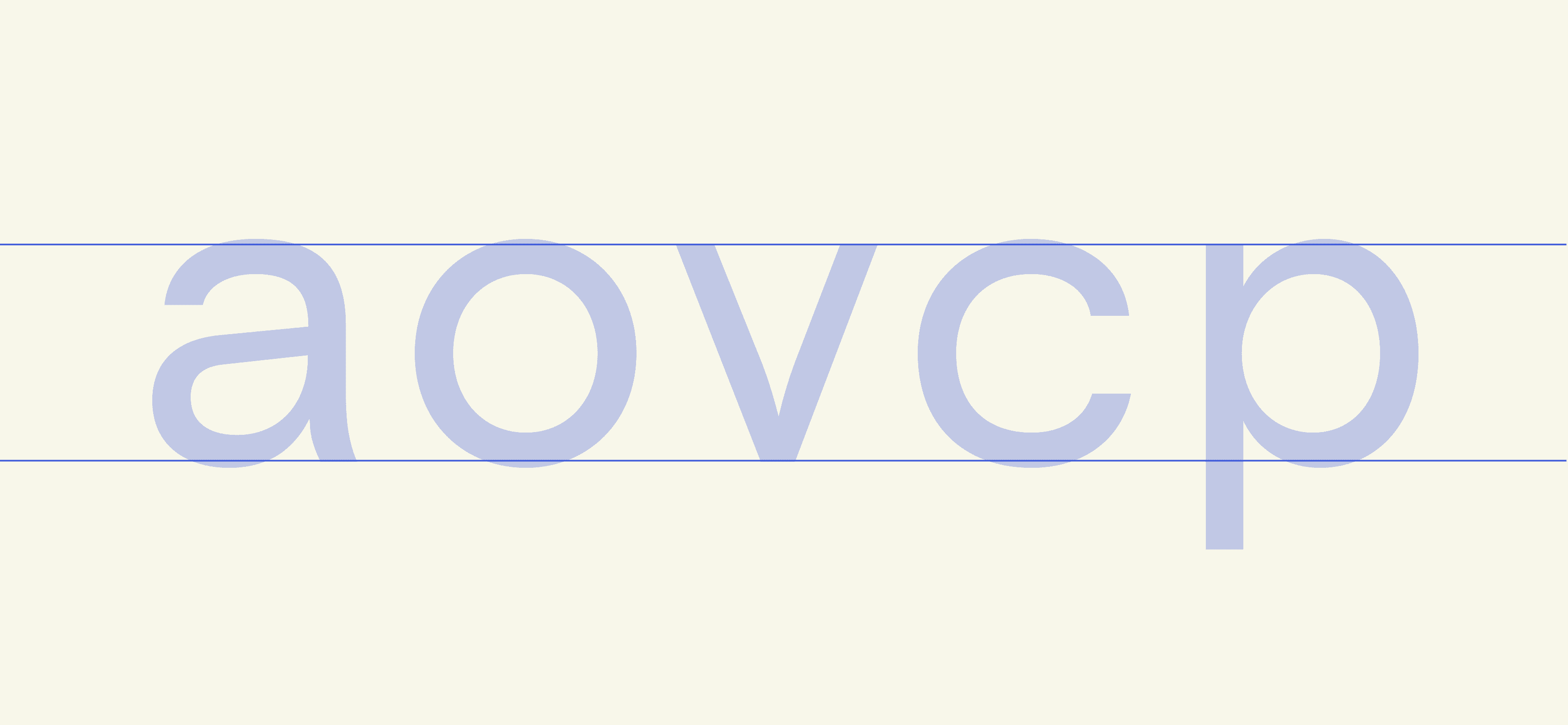
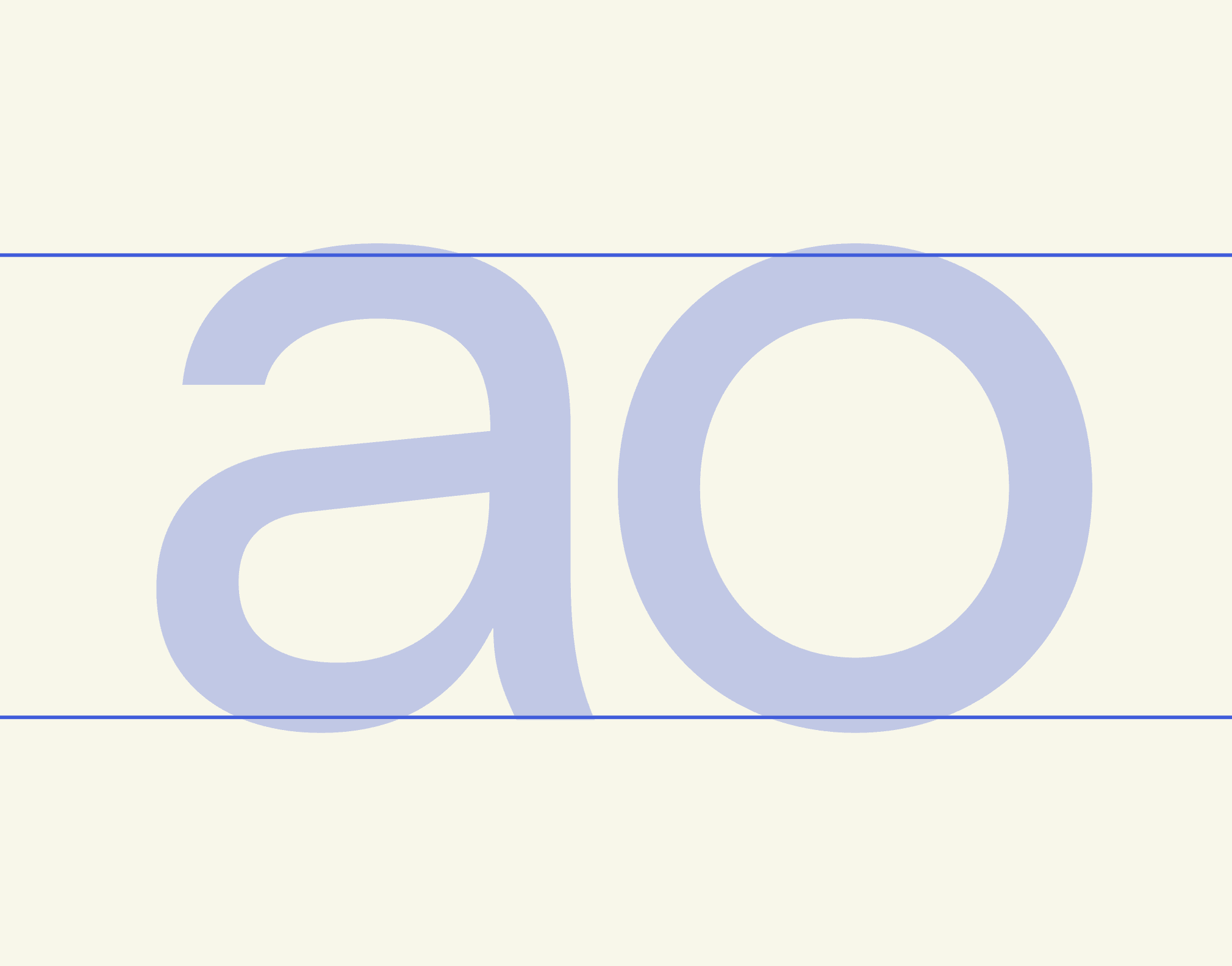
This happens because we perceive curves and straight edges differently. The human eye is much more sensitive to horizontal and vertical alignment, and curved shapes tend to appear smaller when they sit exactly within the same boundaries as rectangular ones. To compensate for that illusion, designers allow rounded shapes to extend just a little beyond the grid so that everything feels visually balanced.
You can see the same principle in many logos. If you overlay a perfect circle on top of the Google logo for instance, you’ll often notice small adjustments. Circles are slightly stretched, curves are softened, and edges are subtly corrected so the shapes feel balanced when viewed by the human eye.
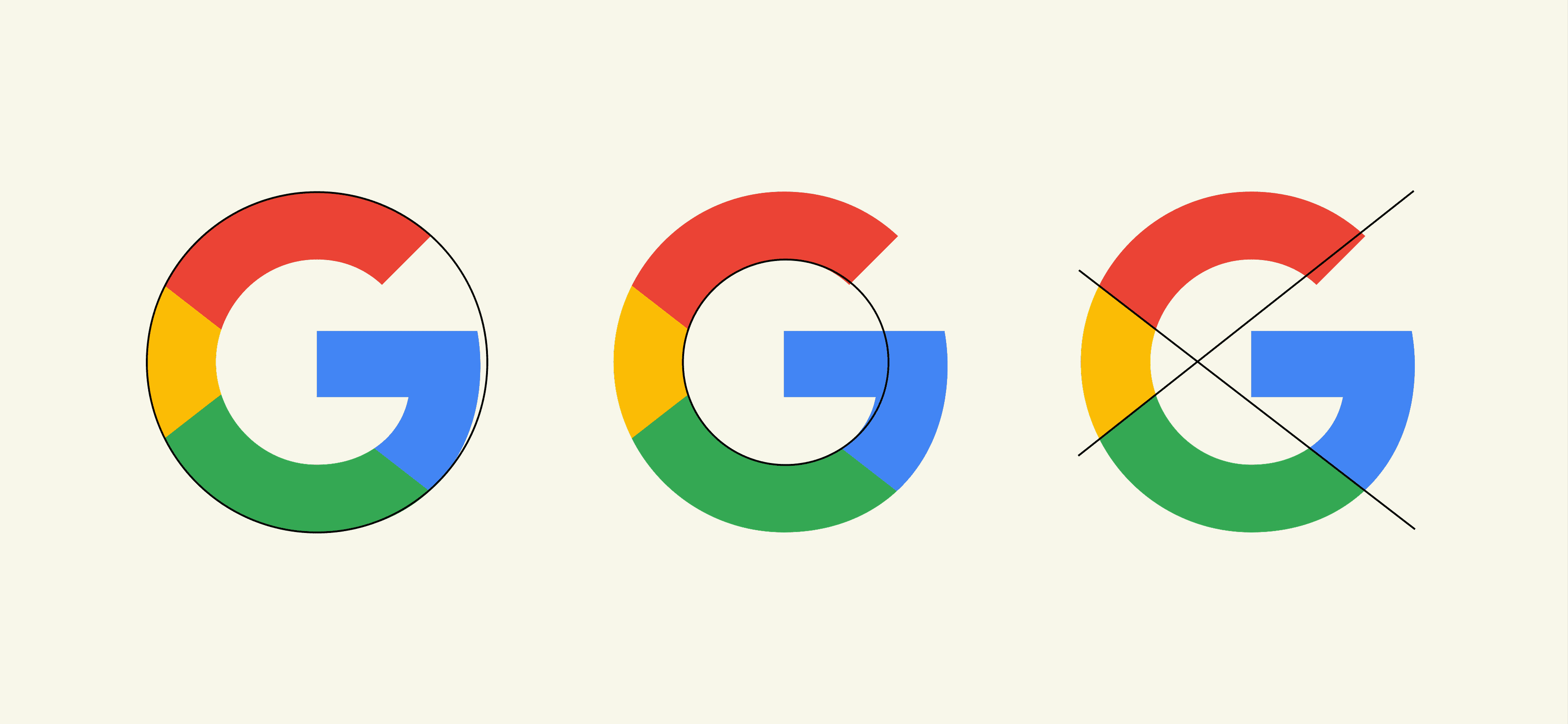
None of these changes are dramatic, and most people will never consciously notice them. But without them, something would feel slightly wrong.
This is one of those quiet rules in design: perfect geometry doesn’t always create perfect visual balance.
None of these changes are dramatic, and most people will never consciously notice them. But without them, something would feel slightly wrong.
This is one of those quiet rules in design: perfect geometry doesn’t always create perfect visual balance.
The Rounded Rectangle
The Rounded Rectangle
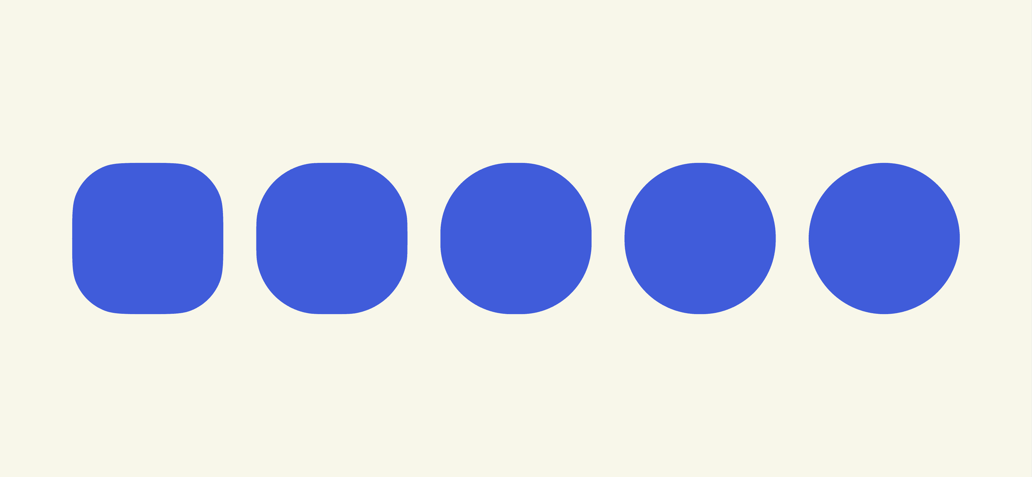
Now think about one of the most common shapes in digital design: the rounded rectangle. Buttons, cards, input fields, icons, they’re everywhere. Open almost any app or website and you’ll see dozens of them.
Most of these shapes are built in a simple way: straight edges connected by circular arcs at the corners. From a geometric point of view, it’s straightforward and easy to implement. Design tools and CSS make it effortless to add a radius and soften the corners of a rectangle.
But if you look a little closer, there’s a subtle issue hiding in that construction.
Where the straight edge meets the circular corner, the curvature changes suddenly. One moment the edge is perfectly straight, and the next it becomes part of a circle. The transition is abrupt.
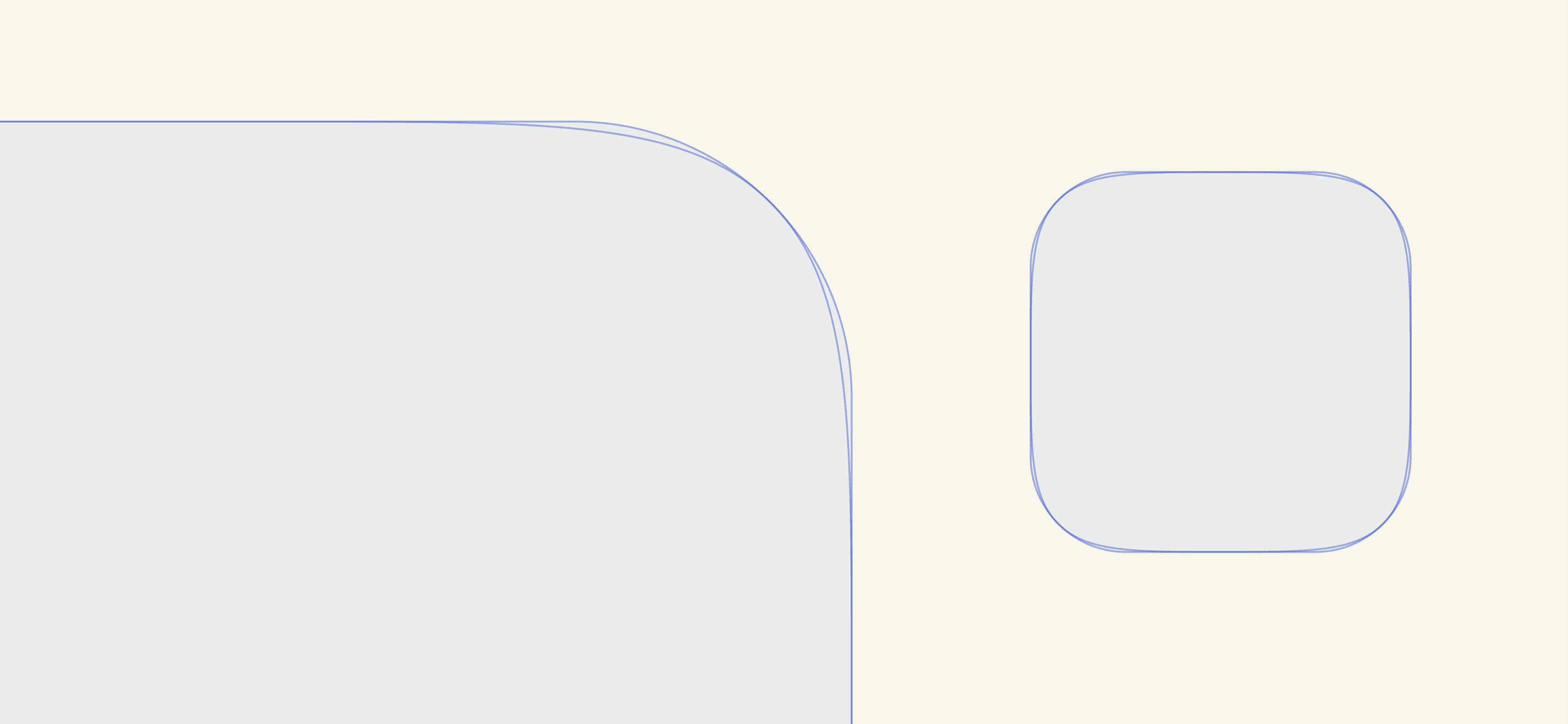
Most people won’t consciously notice it, but our eyes are surprisingly sensitive to these kinds of changes. When a line suddenly turns into a circular arc, the shape can feel slightly mechanical, almost as if it was assembled from separate pieces rather than flowing naturally as a single curve. You don’t actively see the problem, but you can feel it.
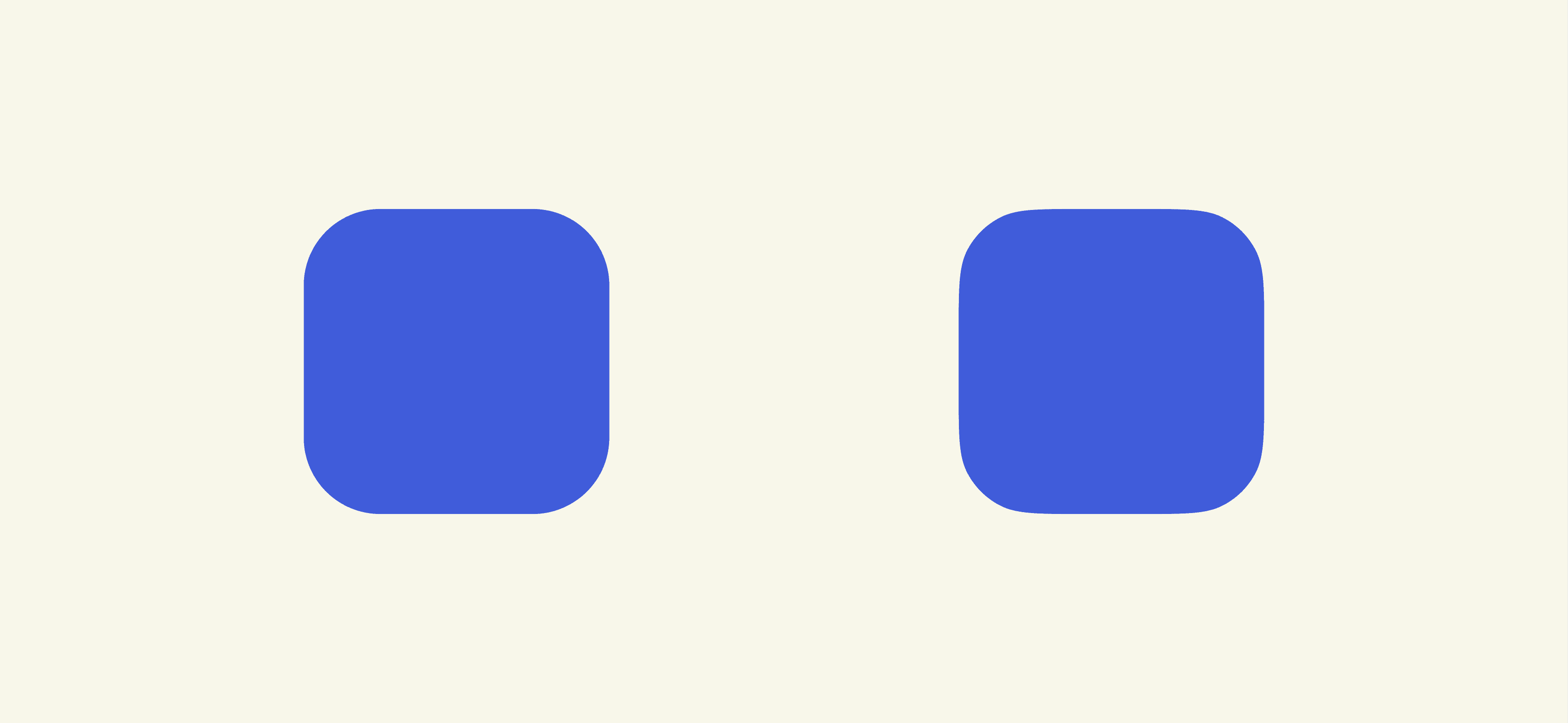
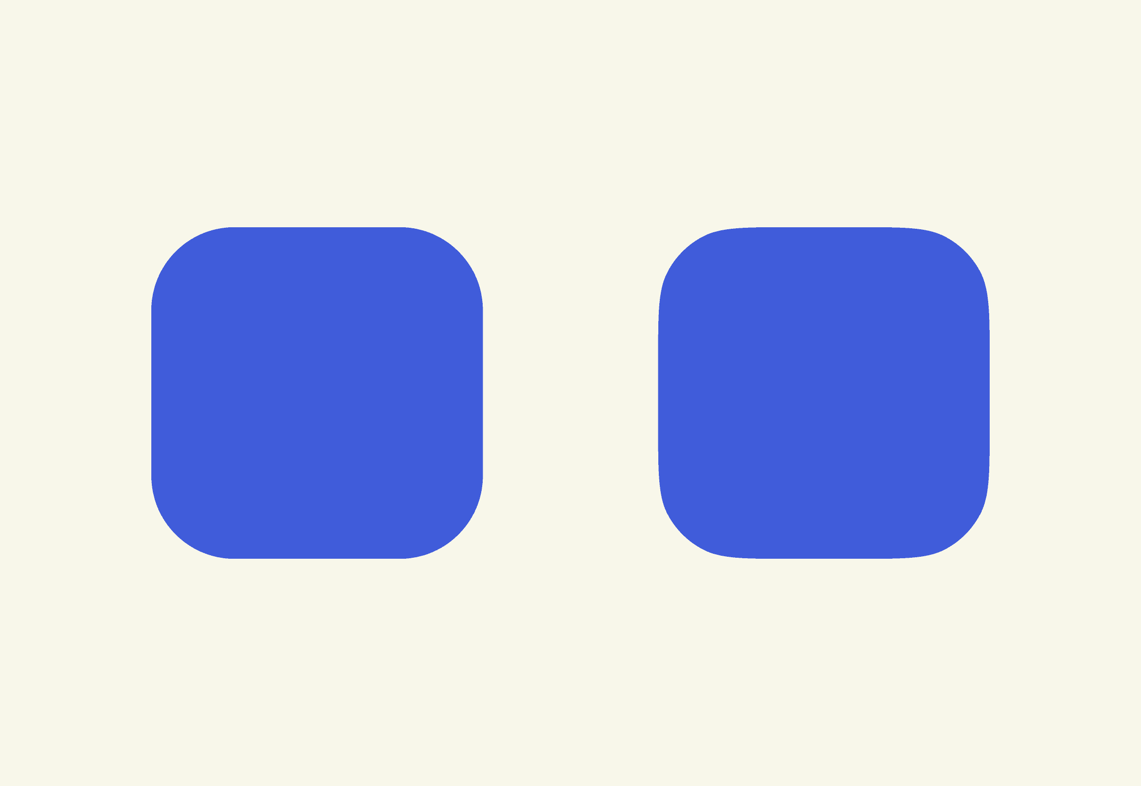
Because of this, many designers prefer curves where the transition from edge to corner happens more gradually, where the geometry flows continuously instead of changing all at once. One mathematical curve that solves this particularly well is called the superellipse.
Most people won’t consciously notice it, but our eyes are surprisingly sensitive to these kinds of changes. When a line suddenly turns into a circular arc, the shape can feel slightly mechanical, almost as if it was assembled from separate pieces rather than flowing naturally as a single curve. You don’t actively see the problem, but you can feel it.
Because of this, many designers prefer curves where the transition from edge to corner happens more gradually, where the geometry flows continuously instead of changing all at once. One mathematical curve that solves this particularly well is called the superellipse.
The Shape Between Square and Circle
The Shape Between Square and Circle
The lesson here is simple but powerful: perfect geometry doesn’t always produce perfect visual balance.
Our eyes interpret curves, edges, and proportions differently than mathematical formulas do. Designers compensate for this through small optical adjustments, overshoot in typography, subtle distortions in logos, and carefully tuned curves in interfaces.
Once you start noticing these corrections, you begin to see design a little differently. The shapes around us aren’t always mathematically perfect, they’re visually corrected.
And sometimes solving that difference requires a completely different kind of curve.
One that sits somewhere between a square and a circle.
That curve is called the superellipse.
