Digital Design
2 April, 2026
Creating Squircles in Figma, Webflow, and CSS
Creating Squircles in Figma, Webflow, and CSS
Learn how to create smoother corners using Figma’s corner smoothing and modern CSS superellipse curves.
Learn how to create smoother corners using Figma’s corner smoothing and modern CSS superellipse curves.

Designing Squircles in Figma
Designing Squircles in Figma
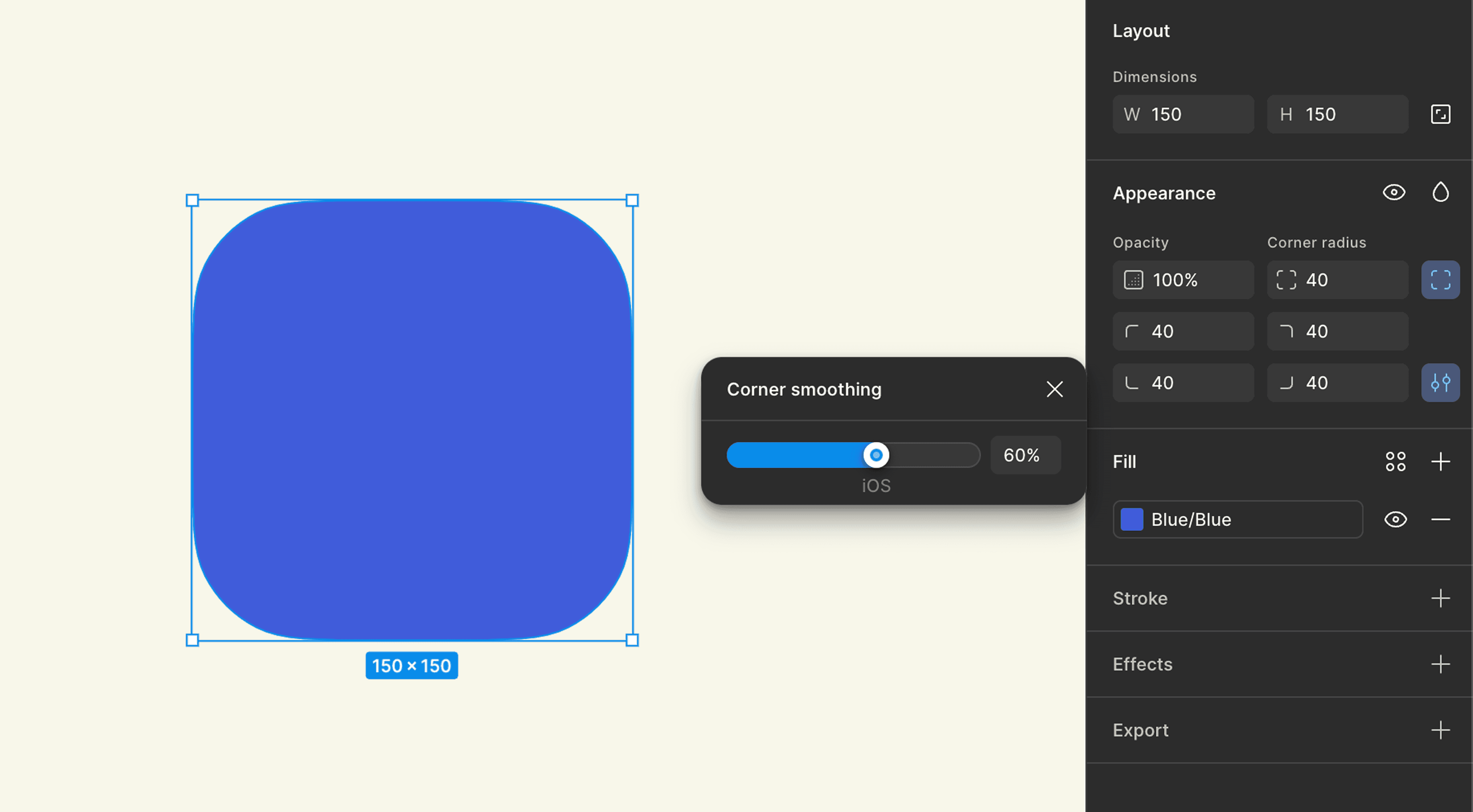
If you’ve ever tried drawing a squircle manually, you know it’s not exactly easy, fortunately, modern design tools have caught up. Figma introduced a feature called Corner Smoothing, which changes how corners behave when you add a radius.
Instead of attaching simple circular arcs to the edges, smoothing gradually adjusts the curvature so the transition feels more continuous.
If you increase corner smoothing to around 60–70%, the shape starts to look very close to a squircle. It’s one of those small features that can quietly improve the feel of a UI.
Bringing Squircles to the Web
Bringing Squircles to the Web
Creating squircles in design tools is easy. Implementing them on the web is a little trickier.
Today, modern CSS even gives us a way to draw these curves directly in the browser. Instead of relying only on border-radius, which produces standard circular corners, we can control the actual shape of the corner using the corner-shape property. Combined with border-radius, it allows us to generate different kinds of corner geometries, including bevel, notch, scoop, squircle, or even a fully adjustable superellipse curve.
.card {
  border-radius: 24px;
  corner-shape: superellipse(2);
}
.card {
  border-radius: 24px;
  corner-shape: superellipse(2);
}
With just these two properties, the browser draws a smoother transition between edges and corners, creating a shape that behaves much closer to a real superellipse than a traditional rounded rectangle. By adjusting the value inside superellipse(), you can gradually shift the shape from more circular to more square.
CSS doesn’t just let us create squircles, it actually gives us a whole range of corner styles to work with.
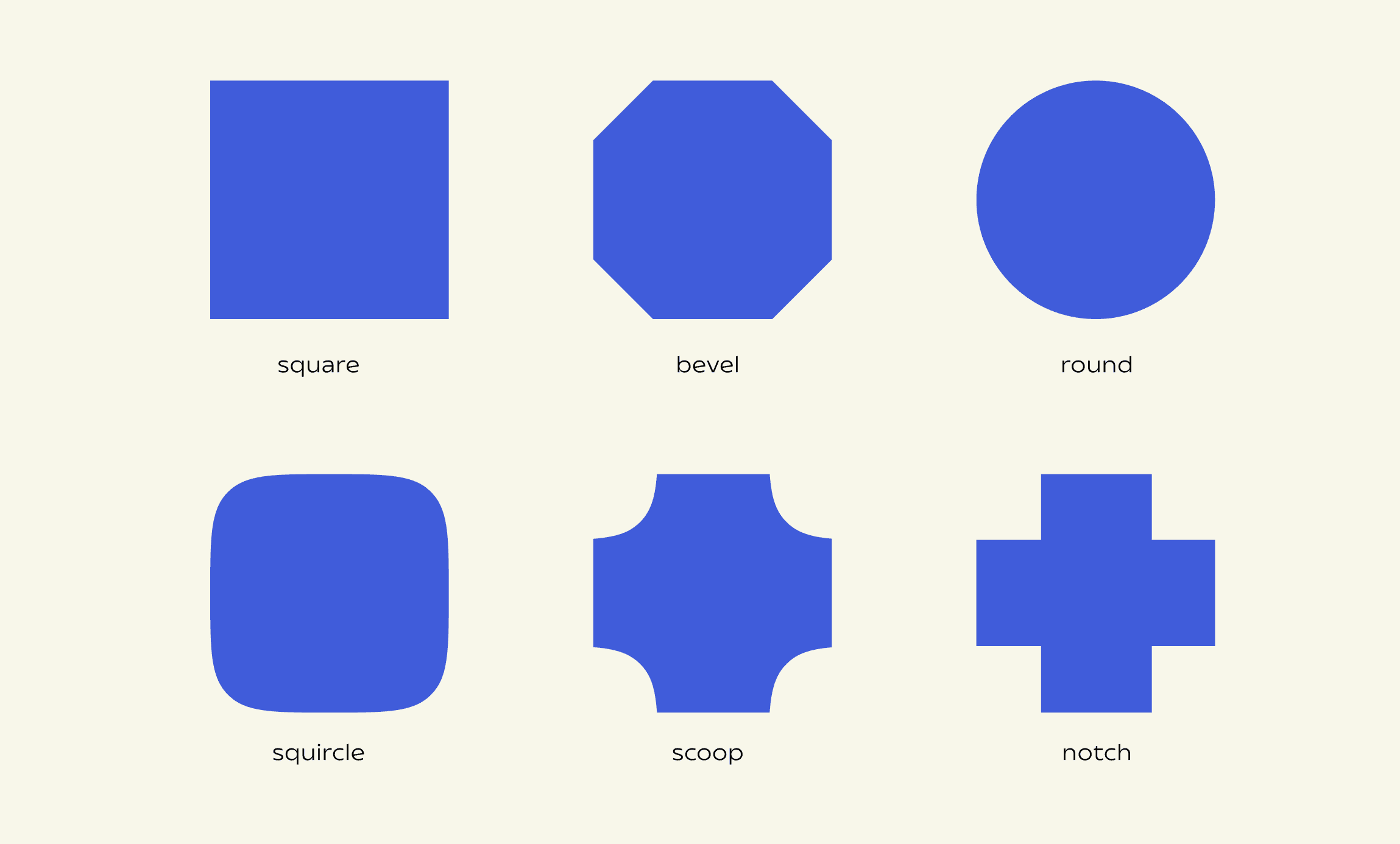
The corner-shape property includes several predefined keywords, each describing a different type of corner geometry. Under the hood, these map to variations of a superellipse curve:
square— a sharp 90° corner, like a box with no border radius appliedbevel— a straight, angled cut across the cornerround— the classic rounded corner created byborder-radiussquircle— a smoother curve that sits between a circle and a squarescoop— a rounded inward (concave) cornernotch— a sharp inward cut, forming a square indentation
These keywords are essentially shortcuts for different superellipse() values, letting you move from sharp to soft, or even invert the curve entirely. See one example below.
With just these two properties, the browser draws a smoother transition between edges and corners, creating a shape that behaves much closer to a real superellipse than a traditional rounded rectangle. By adjusting the value inside superellipse(), you can gradually shift the shape from more circular to more square.
CSS doesn’t just let us create squircles, it actually gives us a whole range of corner styles to work with.
The corner-shape property includes several predefined keywords, each describing a different type of corner geometry. Under the hood, these map to variations of a superellipse curve:
square— a sharp 90° corner, like a box with no border radius appliedbevel— a straight, angled cut across the cornerround— the classic rounded corner created byborder-radiussquircle— a smoother curve that sits between a circle and a squarescoop— a rounded inward (concave) cornernotch— a sharp inward cut, forming a square indentation
These keywords are essentially shortcuts for different superellipse() values, letting you move from sharp to soft, or even invert the curve entirely. See one example below.
.card {
  border-radius: 24px;
  corner-shape: squircles;
}
.card {
  border-radius: 24px;
  corner-shape: squircles;
}
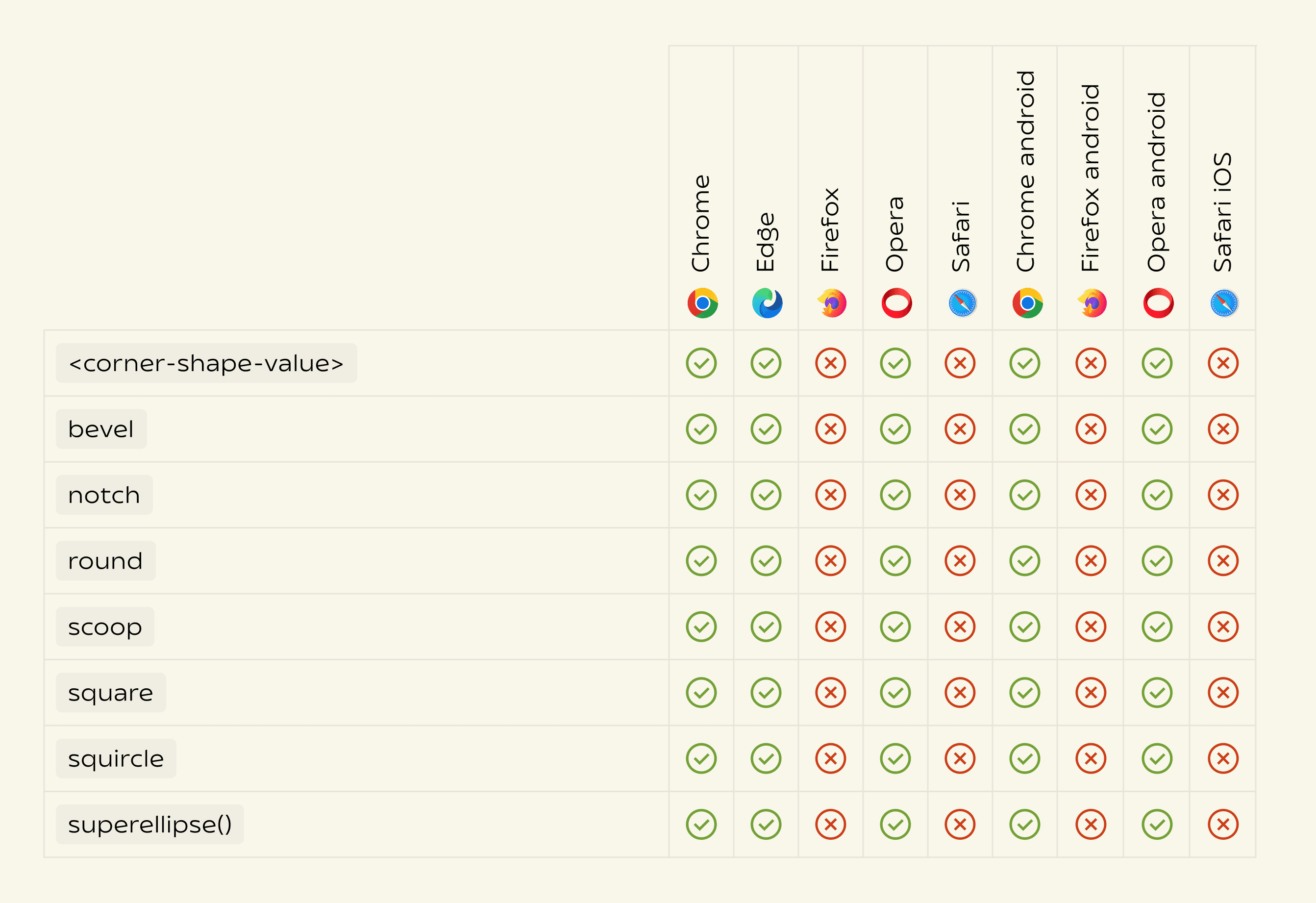
Since this is a relatively new CSS feature, browser support is still evolving. At the moment, only a few modern browsers implement corner-shape and the superellipse() function.
Since this is a relatively new CSS feature, browser support is still evolving. At the moment, only a few modern browsers implement corner-shape and the superellipse() function.
The Safari Problem
The Safari Problem
Even though Apple helped popularize the squircle in modern interface design, Safari still doesn’t support the CSS feature that lets us draw one directly on the web.
Despite Safari having mature border-radius support since Safari 10.1 (2017), it still lacks support for corner-shape and superellipse-based corners. Meanwhile, Chrome only introduced support much more recently, on August 5, 2025.
Because the corner-shape property isn’t supported across all browsers, it’s important to provide a fallback. This ensures that elements still display with regular rounded corners in browsers that don’t support superellipse shapes.
You can do this using a feature query:
@supports (corner-shape: superellipse(2)) {
  .card {
    border-radius: 24px;
    corner-shape: superellipse(2);
  }
}
@supports (corner-shape: superellipse(2)) {
  .card {
    border-radius: 24px;
    corner-shape: superellipse(2);
  }
}
Design Lives in the Details
Design Lives in the Details
Squircles are a perfect example of how small geometric details can subtly improve the feel of an interface.
Most users will never consciously notice the difference between a rounded rectangle and a superellipse. But those tiny improvements in curvature can make layouts feel smoother, more balanced, and more refined.
As design tools and browsers continue evolving, curves like the superellipse will likely become easier to implement and more common across the web.
It’s a small reminder that good interface design often lives in the details, where mathematics, perception, and craft quietly come together.
