Brand Design
29 May, 2026
As AI becomes increasingly powerful and present in our daily lives, brands are moving away from the visual language of innovation and toward signals of trust, expertise and human connection.
For years, the visual language of technology was remarkably predictable.
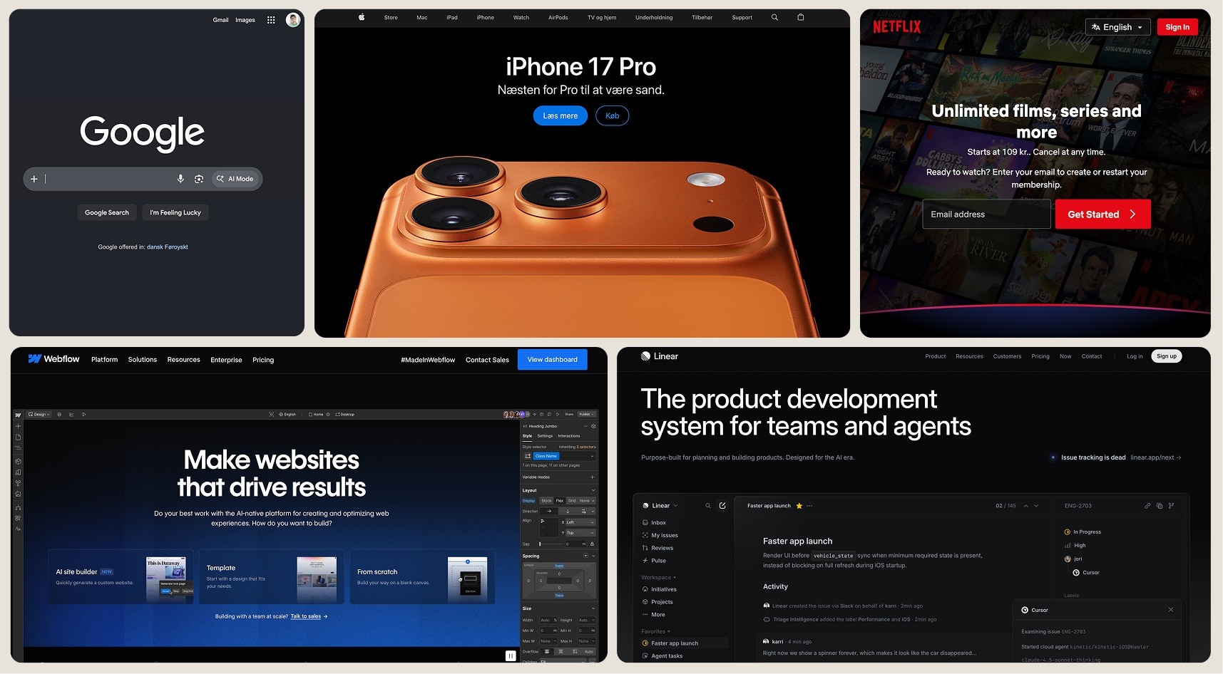
If a company wanted to communicate innovation, the formula was almost always the same: clean sans-serif typography, geometric logos, dark interfaces, gradients glowing somewhere between blue and purple, and enough visual references to code and systems thinking to make it clear that what you were looking at belonged to the future.
And for a long time, it made sense, technology companies were selling progress. They needed to look faster, smarter and more advanced than whatever came before them. Looking futuristic wasn't simply a branding decision, it was part of the product promise itself.
But something feels different today, as AI becomes more integrated into our lives, the brands that seem to resonate the most are not necessarily the ones that look the most futuristic. Increasingly, they are the ones that feel the most human, and I don't think that's a coincidence.
"The challenge is no longer proving the technology works. The challenge is making people comfortable enough to use it. Trust has become a design problem."
The challenge for AI companies today is very different from the challenge technology companies faced a decade ago.
Back then, innovation itself was the differentiator, today, innovation is expected.
Every week brings a new AI model, a new product launch, a new breakthrough. Browse through enough AI websites and the visual language starts to blur together: gradients, glowing interfaces, abstract shapes, san-serifs or monospaced fonts and the familiar promise of intelligence.
The aesthetic that once communicated innovation has become the visual default of an entire category. The irony is that as more companies try to look futuristic, fewer of them actually stand out.
At the same time, something else is happening, the conversation around AI is no longer just about excitement and possibility. It is increasingly shaped by uncertainty.
Many of us are experiencing technology differently than we did five years ago. We are no longer simply adopting new tools; we are trying to keep pace with a landscape that seems to evolve faster every week. New models appear overnight, new skills become essential, and entire industries are questioning what their future might look like.
For many people, AI feels exciting and intimidating at exactly the same time, and when people feel uncertain, they rarely search for more novelty, they search for reassurance.
This is where branding becomes particularly interesting, because AI companies are no longer just selling capability, they are asking users to trust invisible systems with increasingly important tasks: writing, researching, analysing, recommending and making decisions.
The challenge is no longer proving the technology works. The challenge is making people comfortable enough to use it. Trust has become a design problem.
One of the clearest expressions of this shift can be seen in typography.
At first glance, the resurgence of serif typefaces across technology might look like another design trend, but I think something deeper is happening.
Typography has always carried cultural meaning, long before digital interfaces existed, knowledge lived in books, newspapers, journals, archives and academic institutions. For centuries, the written word was the primary vessel through which expertise, authority and collective knowledge were shared.
The visual language of those systems became deeply embedded in our understanding of credibility, this is why I find the current return to editorial aesthetics so fascinating.
We don't trust books because they're old; we trust books because, for centuries, they were one of the primary ways knowledge was preserved, organised and shared.
The same applies to research journals, newspapers and academic publishing, these systems became symbols of expertise not because of nostalgia, but because they established frameworks through which people could learn, verify and build understanding.
When AI companies borrow visual language from publishing and editorial design, they are not borrowing the past, they are borrowing trust.
This idea was captured particularly well by Lucas Luz, Associate Creative Director at &Walsh, who recently observed:
"Serif typefaces are making a comeback, not out of nostalgia, but out of necessity. The overly polished, hyper-uniform AI aesthetic is creating visual fatigue. As a counter-reaction, designers and brands are gravitating toward typefaces that feel more grounded, textured, and imperfect. Classic and contemporary serifs will rise in popularity because they carry warmth, nuance and a feeling of permanence."
Source: Breaking rules and bringing joy: top typography trends for 2026, By Tom May, 28 December 2025
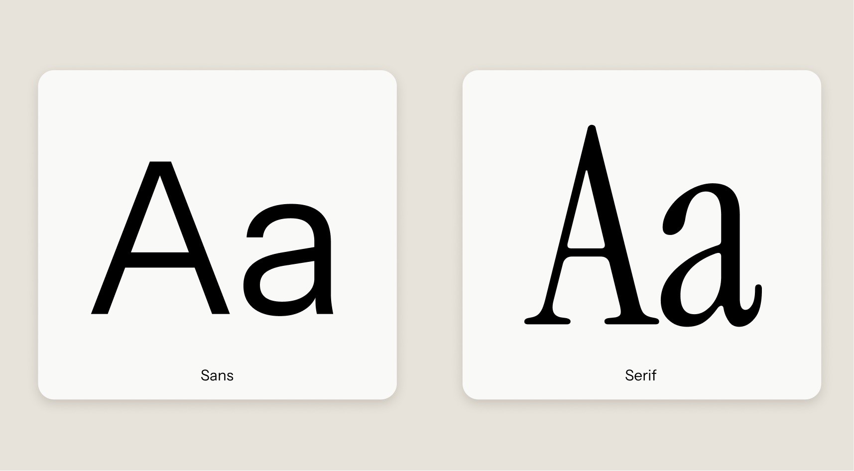
What stands out in that statement is the word necessity, the shift toward serif typography is not happening because designers suddenly miss the past. It is happening because people need new signals that help them navigate a rapidly changing future.
In a world increasingly filled with machine-generated content, typography becomes more than a design choice. It becomes a cultural signal. A way of communicating care, authorship and human intention.
Perhaps no company illustrates this shift more clearly than Anthropic.
While many AI companies continue to communicate intelligence through highly technical visual systems, Anthropic has built a brand that feels remarkably different.
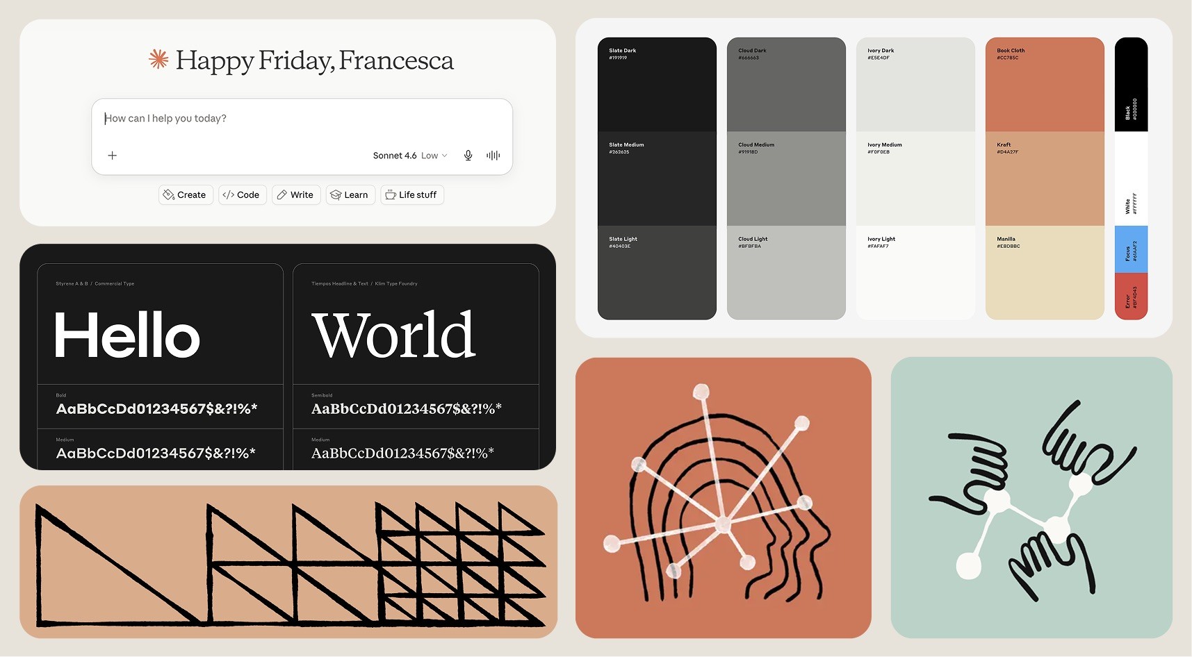
Its identity draws heavily from editorial design, warm colour palettes replace cold gradients. Illustration plays a more prominent role than abstract technological imagery and serif typography sits at the heart of the experience.
The result feels less like a software company and more like an institution dedicated to knowledge, that distinction matters.
Anthropic is not simply selling intelligence, it is selling judgment.
Its products ask users to trust an invisible system with increasingly complex tasks, and the brand reflects that responsibility. Rather than emphasising technological sophistication, it emphasises thoughtfulness, clarity and reassurance.
Interestingly, this broader movement is already being recognised by branding and design leaders. As Charlie Beeson, Design Director at FutureBrand, recently noted:
"2026 marks a shift: it's about reconnecting with the human side of design."
Source: Anthropic, Making AI safe for humanity
That observation feels particularly relevant to AI, for years, technology branding was obsessed with communicating capability, today, the challenge is different.
As AI becomes increasingly powerful and increasingly invisible, users are looking for signals that remind them there are human values, human decisions and human intentions behind the technology.
Claude's typography is perhaps the most interesting example.
The use of serif typefaces, editorial layouts and italic styling creates a subtle but powerful shift in perception, It feels less like a machine designed to process information and more like a thoughtful system designed to interpret it.
Less like software, more like trustworthy colleague. The difference might seem small, but branding often operates through these kinds of signals.
Before users read a sentence, before they understand the technology, before they experience the product itself, they have already formed an impression and typography helps shape that impression.
Traditional technology branding often communicates precision, Claude's typography communicates reflection. One aesthetic says computation, the other says understanding.
And in a category where many companies are competing on capability, that distinction feels increasingly valuable.
"Trust is no longer something a company can simply claim. It has to be designed."
If there is one lesson emerging from the latest generation of brands that have AI products as the core business, it is this: Trust is no longer something a company can simply claim. It has to be designed.
For years, branding focused on communicating innovation. The goal was to look modern, efficient and technologically advanced. That approach made sense when the strategy was only to show technological progress and cutting-edge software; in that case having a futuristic look was enough to signal value.
Today, however, the landscape feels very different, most people no longer need convincing that AI is powerful, they are already surrounded by evidence of that.
The challenge is no longer convincing people that the technology works, the challenge is helping people feel comfortable enough to build a relationship with it.
That requires a different set of design principles, perhaps the most successful AI brands of the next decade won't be the ones that look the most futuristic, but the ones that feel the most understandable, reliable and backed up by real specialists that knows how to navigate in this constantly changing technological word.
Brands that communicate clarity instead of complexity, warmth instead of spectacle, and human judgment instead of machine capability.
This doesn't mean abandoning innovation or pretending technology isn't changing the world, it means recognising that people need anchors as much as they need progress.
Interestingly, this is where typography, editorial design and more human visual systems become particularly relevant. The growing shift towards these aesthetics reflects a desire for signals of craft, care and permanence, qualities that have become increasingly valuable in a world where technology often feels intangible, fast-moving and difficult to fully understand.
The important words here are not serifs or even history. It's craft.
Because what people are increasingly responding to isn't a specific typeface or aesthetic trend. It's evidence that someone cared, that someone made a decision, that there is human intention behind the experience.
As AI makes polished design easier to generate and rise the bar for the visual standards, these signals become increasingly valuable.
The brands that feel right in this new era will likely be the ones that can balance two seemingly opposing forces, they will embrace the possibilities of the future while remaining connected to the values people have trusted for generations: clarity, authorship, strategy, expertise, care and human judgment.
Not because those values are old, because they are enduring.
For years, technology branding operated under the assumption that the most advanced companies should look the most advanced.
That logic made sense when technological progress itself was the primary story.
Today, however, we are entering a different chapter, as AI makes intelligence more accessible and polished aesthetics easier to generate, visual sophistication alone becomes less meaningful, perfection becomes the new standard.
What becomes scarce is evidence of human intention, thoughtfulness, taste, judgment and care.
The brands that stand out over the next decade may not be the ones that look the most technological. They may be the ones that understand how to make technology feel understandable, approachable and trustworthy.
Perhaps that is why editorial typography is returning, perhaps that is why brands like Anthropic feel so distinctive. And perhaps that is why the future of AI branding may ultimately look less like a machine and more like a person,
not because we're moving backwards. But because, in a world increasingly shaped by artificial intelligence, humanity becomes one of the most valuable signals a brand can communicate.